Project description
Duration: 2 days
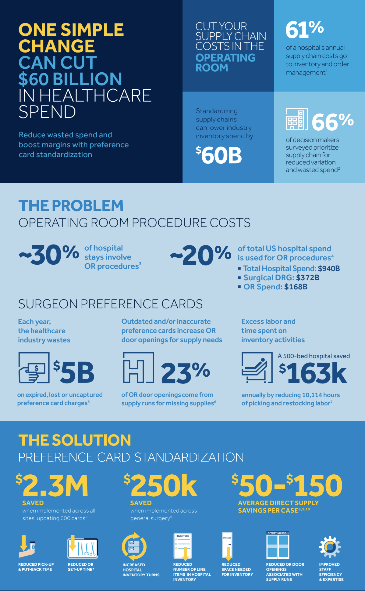
As part of a design exercise, I worked on designing and prototyping an analytics dashboard. With the help of existing Electronic medical record(EMR) data, this platform aims to help hospitals standardize their preference cards and manage their supplies to ultimately result in increased productivity and revenue.
Design brief
Design a dashboard screen that represents relevant KPIs as graphs showing changes from a certain date of intervention:
1) Number of items wasted in past versus since interventions
2) The cost in OR time for missing item
3) Changes to the preferences cards (this shows a list of changes to cards over the time period and the associated savings)
4) Revenue captured over time
5) Reduction in variation in vendor spend
6) Reduction in variation in surgeons doing the same surgery
Process
Discovery
Step 1: I started with decoding and understanding the requirements shared by the company. During this phase, I also learned about the essential terms and concepts used in the document, e.g. Picklist, Preference cards.
(Desired but out of scope for this exercise - Stakeholder interviews: Connect with stakeholders to clarify doubts)
User scenarios
Step 2: I imagined how users would interact with the system and sketched out some basic user scenarios.
Define secondary features
Step 3: KPIs were already defined in the document but based on the user scenarios; I defined some secondary features, e.g. download graph, select a view, select a department etc.
(Desired but out of scope for this exercise - User research to validate the need for each secondary feature)
Secondary research
Step 4: During this phase, I learned more about graphs and data visualization. This helped me align the data with right representation so that it is easy to consume.
Ideation
Step 5: Converted each KPI into a format that is insightful and easy to absorb for the user.
KPI-based wireframes
Step 6: Created wireframes of graphs for each KPI individually.
Dashboard wireframes
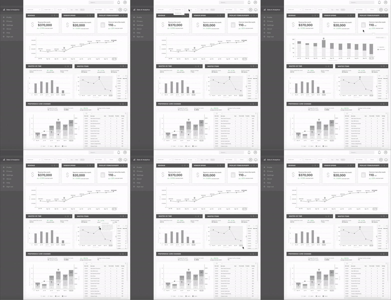
Step 7: I tried different layouts and compiled individual wireframes into a single dashboard wireframe.
(Desired but out of scope for this exercise - User testing)
Visuals
Step 8: I have not worked on the visual design of the Dashboard for this exercise but have worked on providing a visual hierarchy to the content.
Documentation
Step 9: As the last step, I worked on creating an interactive prototype using Principle and then created a graphic explanatory sheet for the Dashboard screen using Sketch.


